The difference between an ordinary photograph and a compelling image often has little to do with expensive equipment. The most striking improvement in your photography can come from mastering composition—the deliberate arrangement of elements within your frame. While technical settings like aperture and shutter speed matter, it’s composition that determines whether viewers stop scrolling to engage with your image.
1. Rule of Thirds: The Foundation of Balanced Composition
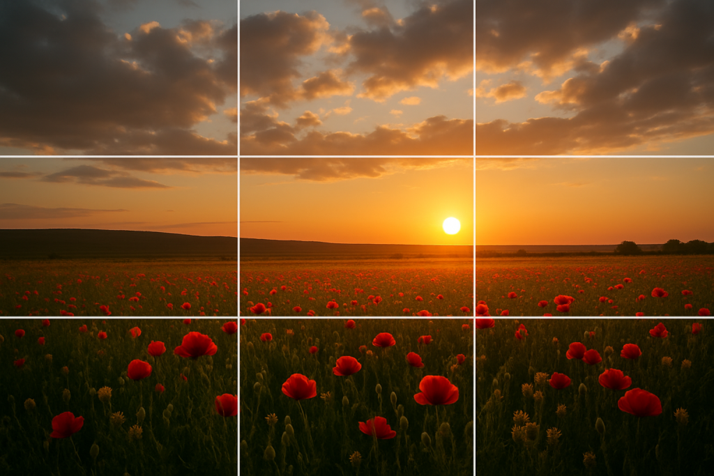
The rule of thirds divides your frame into nine equal segments using two horizontal and two vertical lines. Placing key elements along these lines or at their intersections creates balance and visual interest.
Why it works: This arrangement creates tension, energy, and interest that’s more engaging than simply centering your subject. Studies tracking eye movement show that viewers naturally focus on these intersection points.
How to practice: Enable the grid overlay on your camera or smartphone. For landscapes, try aligning the horizon with the top or bottom horizontal line rather than cutting the image in half. For portraits, position your subject’s eyes along the top line or at the intersection points.
When to break it: For symmetrical subjects, reflections, or when you want to convey formality or stability.
2. Leading Lines: Guiding the Viewer’s Journey

Leading lines are visible lines within your composition that guide the viewer’s eye toward your main subject or through the frame. These can be roads, fences, shorelines, or even implied lines created by a row of objects.
Why it works: Our brains naturally follow lines to see where they lead. This creates a visual journey through your image, increasing engagement time and impact.
How to practice: Look for natural lines in your environment—rivers, paths, buildings, or shadows. Position yourself so these lines lead toward your subject or create depth by converging toward a vanishing point.
When to break it: When you want to create a sense of disorientation or when the lines would distract from a powerful subject.
3. Framing: Creating Images Within Images
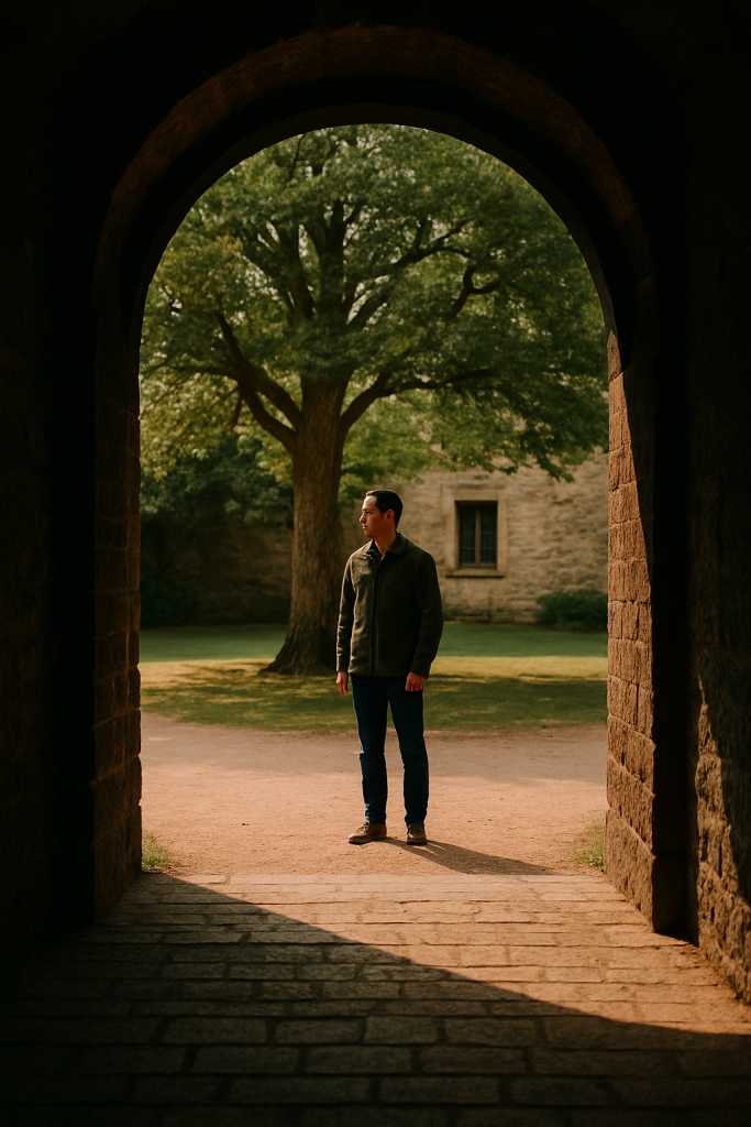
Framing uses elements within the scene to create a natural border around your subject. Doorways, windows, arches, tree branches, or even human elements can serve as frames.
Why it works: Frames add depth, context, and focus attention on your subject while creating a more layered, three-dimensional feel.
How to practice: Look for architectural elements, natural formations, or foreground objects that can surround your subject. Experiment with partial frames that border just one or two sides of your image.
When to break it: When simplicity serves your subject better or when potential framing elements would compete with rather than enhance your subject.
4. Symmetry and Patterns: Finding Order in Chaos

Symmetrical composition creates balance by mirroring elements across the frame, while pattern-based composition highlights repetitive elements for visual impact.
Why it works: Humans are naturally drawn to symmetry and patterns—they satisfy our desire for order and harmony while being visually pleasing.
How to practice: For symmetry, position yourself directly in the center of your subject and ensure your horizon is perfectly level. For patterns, look for repetitive elements in architecture, nature, or human arrangements, then fill your frame with the pattern.
When to break it: Introduce a pattern interruption—a single element that breaks the pattern—to create a focal point and add tension to an otherwise uniform composition.
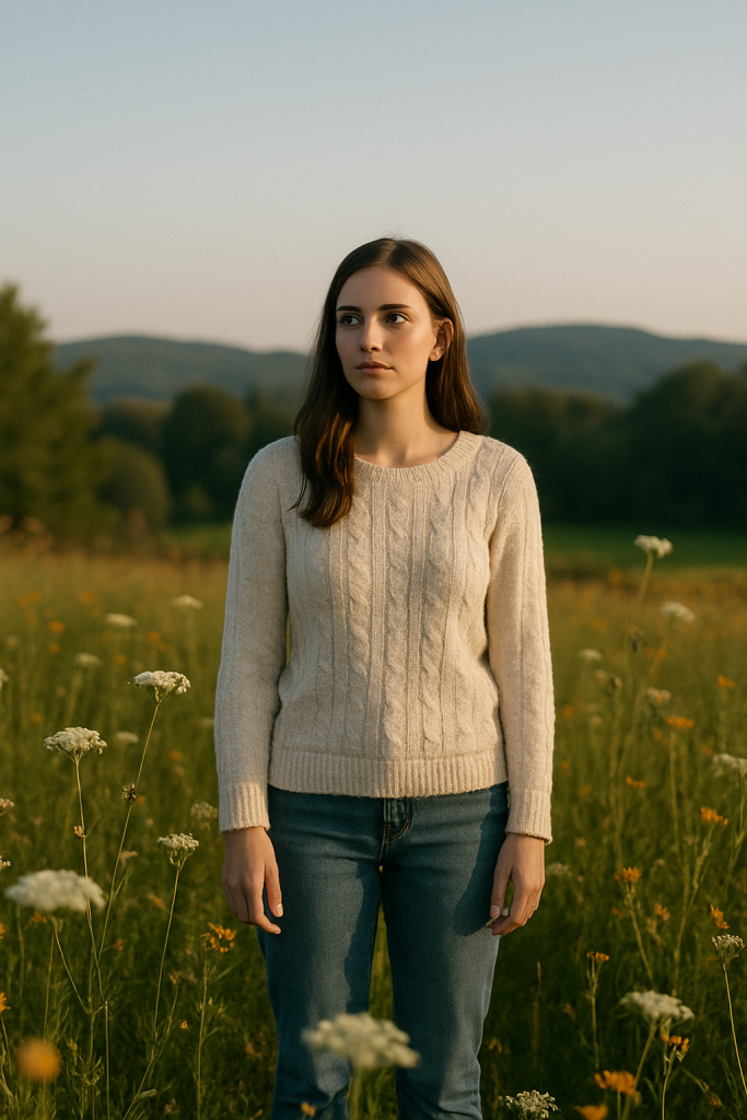
5. Negative Space: The Power of What’s Not There

Negative space is the empty area surrounding your subject. Using it deliberately creates breathing room and emphasizes your subject through contrast.
Why it works: Negative space creates visual rest, prevents cluttered compositions, and draws attention to your subject through isolation.
How to practice: Look for clean backgrounds like empty sky, still water, or monochrome walls. Position your subject to occupy a smaller portion of the frame than you might instinctively choose.
When to break it: For scenes where environmental context is crucial or when documenting busy, chaotic situations where the density of elements tells the story.
6. Depth of Field: Controlling Visual Hierarchy
While technically a camera setting, depth of field is a powerful compositional tool that determines which elements are in sharp focus and which are blurred.
Why it works: Selective focus guides viewers directly to your intended subject while creating a sense of depth and dimension.
How to practice: Use a wide aperture (low f-number) to create shallow depth of field for portraits or detail shots. Use a narrow aperture (high f-number) when you want everything from foreground to background in focus, as in landscape photography.
When to break it: When documenting scenes where all elements have equal importance or when you want to challenge viewers to explore the entire frame.
7. Color Theory: Emotional Impact Through Hues

Color composition involves deliberately using color relationships—complementary, analogous, monochromatic—to create mood and visual impact.
Why it works: Colors evoke emotional responses and create visual relationships between elements in your frame.
How to practice: Look for complementary colors (opposite on the color wheel) for high-contrast, energetic images. Use analogous colors (adjacent on the color wheel) for harmonious, cohesive scenes. Try isolating a single bold color against a neutral background for dramatic effect.
When to break it: When documenting reality as it appears or when the subject matter is more important than the aesthetic arrangement of colors.
8. The Golden Ratio: Mathematics of Beauty

The golden ratio (approximately 1:1.618) has been used in art and architecture for centuries. In photography, it manifests as the golden spiral, which creates a natural flow through your image.
Why it works: This mathematical ratio appears throughout nature and creates compositions that feel naturally balanced and aesthetically pleasing.
How to practice: Some cameras offer a golden ratio overlay. Position key elements along the spiral or at its center. The golden ratio is slightly more complex than the rule of thirds but often creates more sophisticated compositions.
When to break it: When simplicity is more important than mathematical precision or when working with subjects that don’t naturally conform to these proportions.
9. Triangles: Creating Dynamic Stability

Triangular composition arranges elements to form actual or implied triangles within your frame, creating stability with dynamic energy.
Why it works: Triangles combine the stability of their wide base with the dynamic energy of their pointed top, creating compositions that feel both grounded and energetic.
How to practice: Look for three-point relationships between elements in your scene. In portraits, a subject’s head and shoulders naturally form a triangle. In group shots, arrange people in triangular formations rather than straight lines.
When to break it: When documenting spontaneous moments where arrangement isn’t possible or when circular or rectangular compositions better suit your subject.
10. Balance: Harmonizing Visual Weight

Balance in composition refers to the distribution of visual weight—the perceived heaviness of elements based on their size, color, texture, and position in the frame.
Why it works: Balanced compositions feel complete and resolved, while deliberately unbalanced compositions create tension and drama.
How to practice: For formal balance, arrange elements symmetrically. For informal balance, counteract a visually heavy element on one side with several lighter elements on the opposite side. Consider that dark colors, complex textures, and unusual shapes carry more visual weight than light, simple elements.
When to break it: Create deliberate imbalance to convey instability, tension, or discomfort when these emotions serve your storytelling purpose.
Putting It All Together: The Compositional Workflow
Rather than trying to apply all these rules simultaneously, develop a compositional workflow:
- Identify your subject and what drew you to the scene
- Choose your primary compositional approach based on the subject and environment
- Position yourself to implement that approach
- Check the edges of your frame for distractions
- Make micro-adjustments to refine the composition
- Consider breaking a rule deliberately if it strengthens your image
Remember that these “rules” are really just proven patterns that human beings find visually appealing. They’re tools in your creative toolkit, not rigid requirements.
Beyond the Rules: Developing Your Compositional Eye
The ultimate goal isn’t to mechanically apply rules but to develop an intuitive sense of composition that becomes second nature. This comes through:
- Studying master photographers and analyzing their compositional choices
- Practicing deliberately with composition-focused photo walks
- Reviewing your work critically with composition as your primary criterion
- Experimenting with breaking rules intentionally to understand why they work
Interactive learning tools like those available through Jotverse can help you practice these compositional principles through guided exercises and personalized feedback, accelerating your development as a photographer. You can learn about composition and more about photography with our pre-trained AI Photography Tutor
The most powerful compositions often combine multiple principles simultaneously—perhaps using leading lines that follow the golden ratio, guiding the eye to a subject positioned at a rule of thirds intersection point, framed by foreground elements.
As you master these principles, you’ll move beyond taking snapshots to creating photographs with intention, impact, and artistic vision.